Design Tower
COMPANY WEBSITE
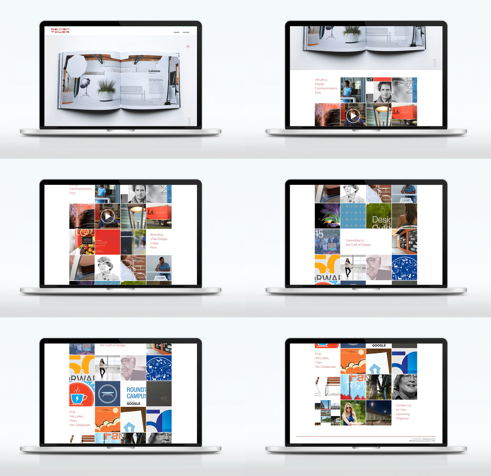
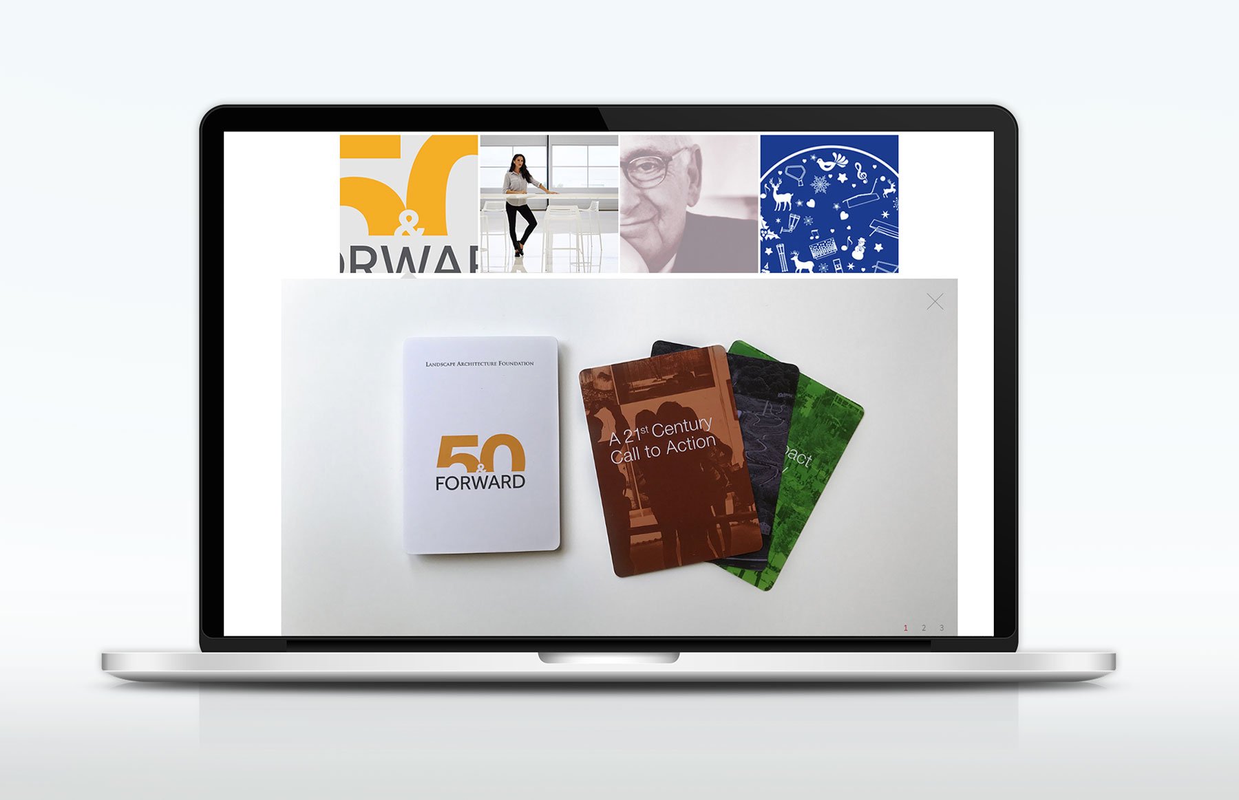
While I was at Design Tower, I undertook the redesign and development of the agency's website to better showcase our diverse portfolio of work. Our goal was to create a clean and straightforward design, so I opted for a solid white background with subtle touches of color. The grid layout featuring zoom-in thumbnails proved effective in presenting our extensive body of work.


